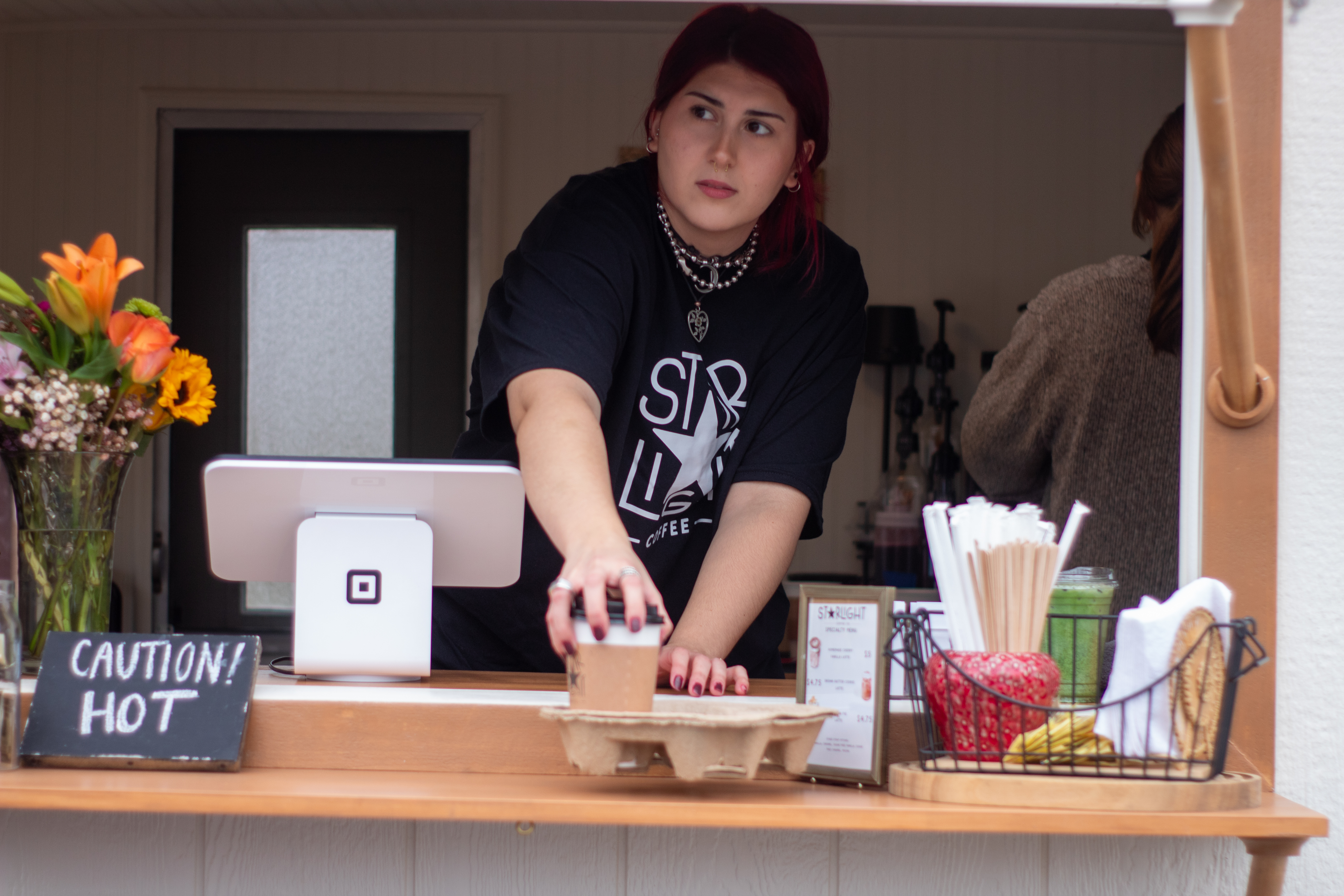
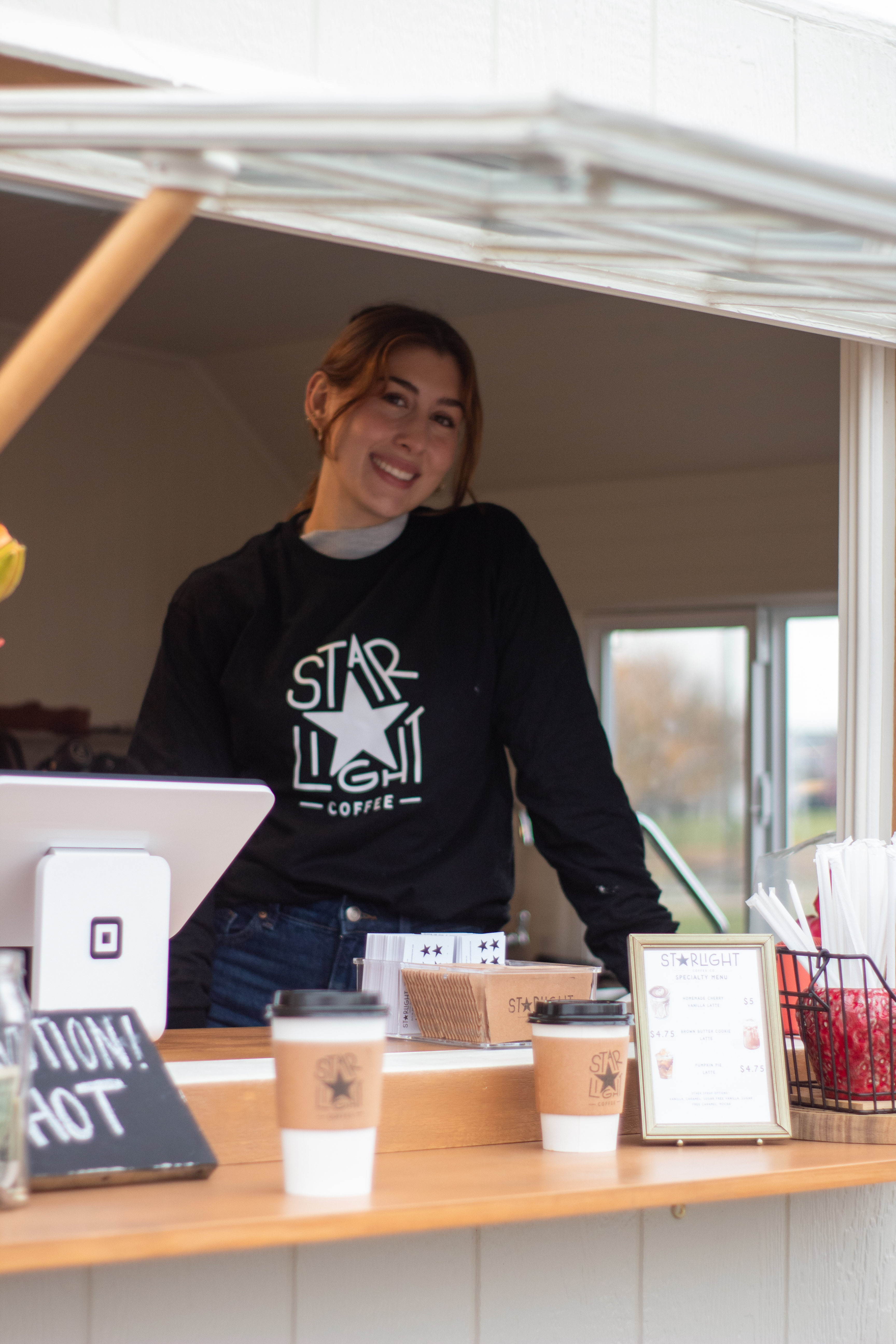
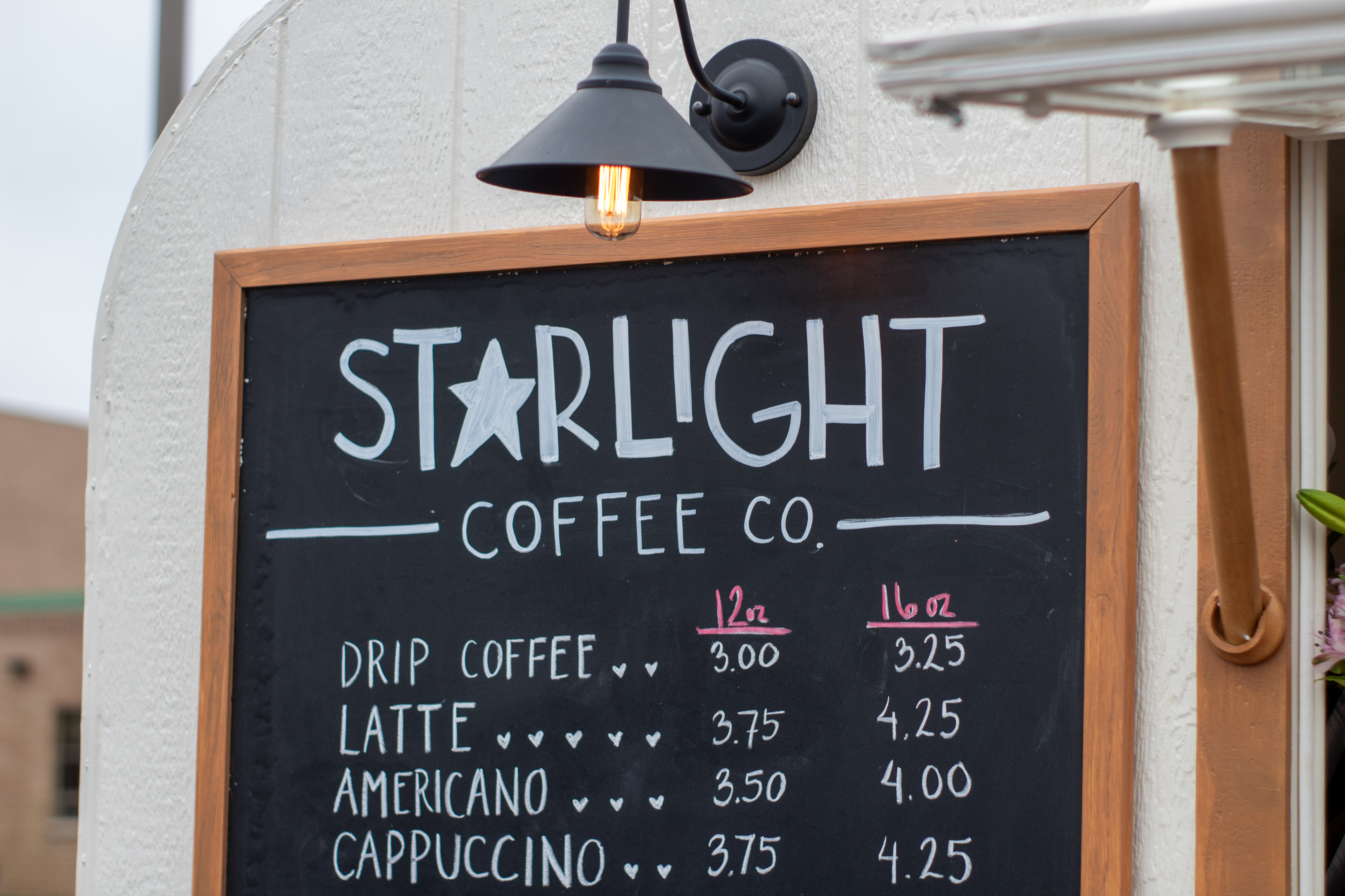
Starlight Coffee
Branding for a locally-owned coffee shop located in Joliet, IL. The owner renovated an old trailer, and has a keen eye for thrifting cute decor for the shop!
I was brought along to help with the logo design and branding early in the process. She wanted something that felt playful yet liquid enough to fit into any color scheme/vibe that the decor of the trailer had.
I was brought along to help with the logo design and branding early in the process. She wanted something that felt playful yet liquid enough to fit into any color scheme/vibe that the decor of the trailer had.

LOGO SKETCHES
Original sketches of the Starlight logo. When we talked about the logo feeling playful yet fluid, I knew that typographic variation could be a good way to introduce play in a way that wouldn’t distract from the color/decor choices made along the way.


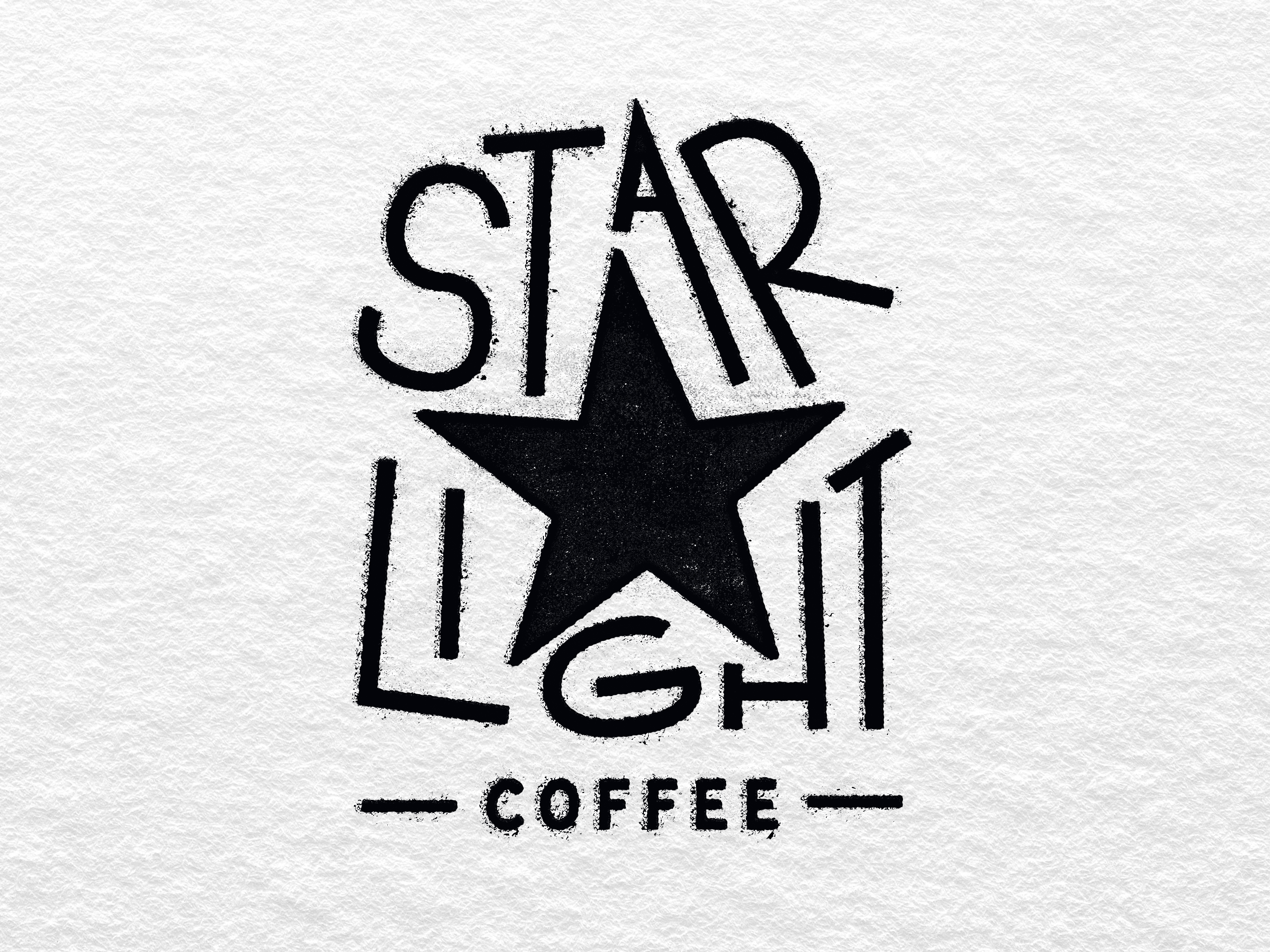
FINAL LOGO
The final logo features two lock-ups that compliment each other with handlettering and the font “Flapjack” by Taylor Penton. The owner told me she was going to be using the logo as a stamp, and I was sure to include that in the final presentation an idea of what it might look like.